Brand resources
The Comis identity.
A clear mark for a clear idea: it does the work, and you keep the keys.


Give it room.
Use the primary logo on white or a light surface, and the reversed logo on graphite. Keep the proportions intact. Leave at least a quarter of the symbol’s height clear around the logo. Use the symbol alone when the Comis name is already visible nearby. The SVG lettering is outlined.
The colors.
Graphite
#111418Gate green
#12A05AHub blue
#2458E6Approval coral
#E5493BStrong type.
Human materials.
Archivo carries the name and headlines. JetBrains Mono handles small labels. Graphite and white leave space for the work; green identifies the Gate.
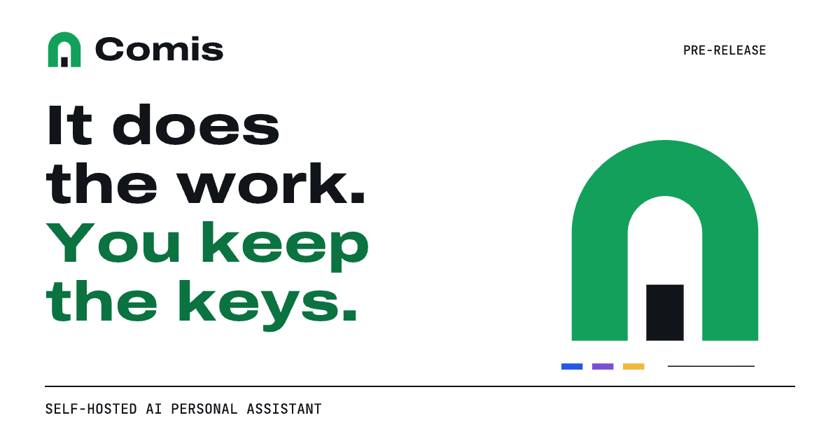
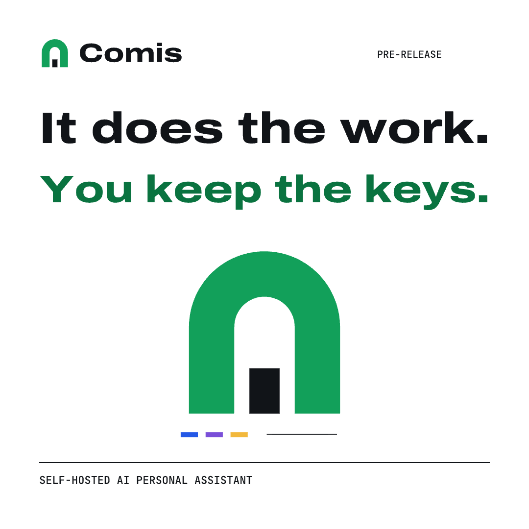
The campaign illustration is a visual metaphor for delegation and owner control, not a product screenshot. Keep the pre-release label on campaign artwork.